Read the Room - where I walk you through a room and let you see with me. To inspire and inform, with ideas and concepts, with ways and means, for living in and furnishing our homes.
I’m thrilled to invite you into the kitchen of Tara Mangini and Percy Bright, of the famed two-person renovation company, Jersey Ice Cream Co. After spending a decade renovating houses for clients, they turned their talents toward their own antique farmhouse in upstate New York, purchased five years ago.
Tara and Percy are known for creating understated interiors where they allow natural materials and a raw, artisan feeling to permeate the spaces. Theirs is a relaxed, natural aesthetic that is refreshingly welcoming and unpretentious.
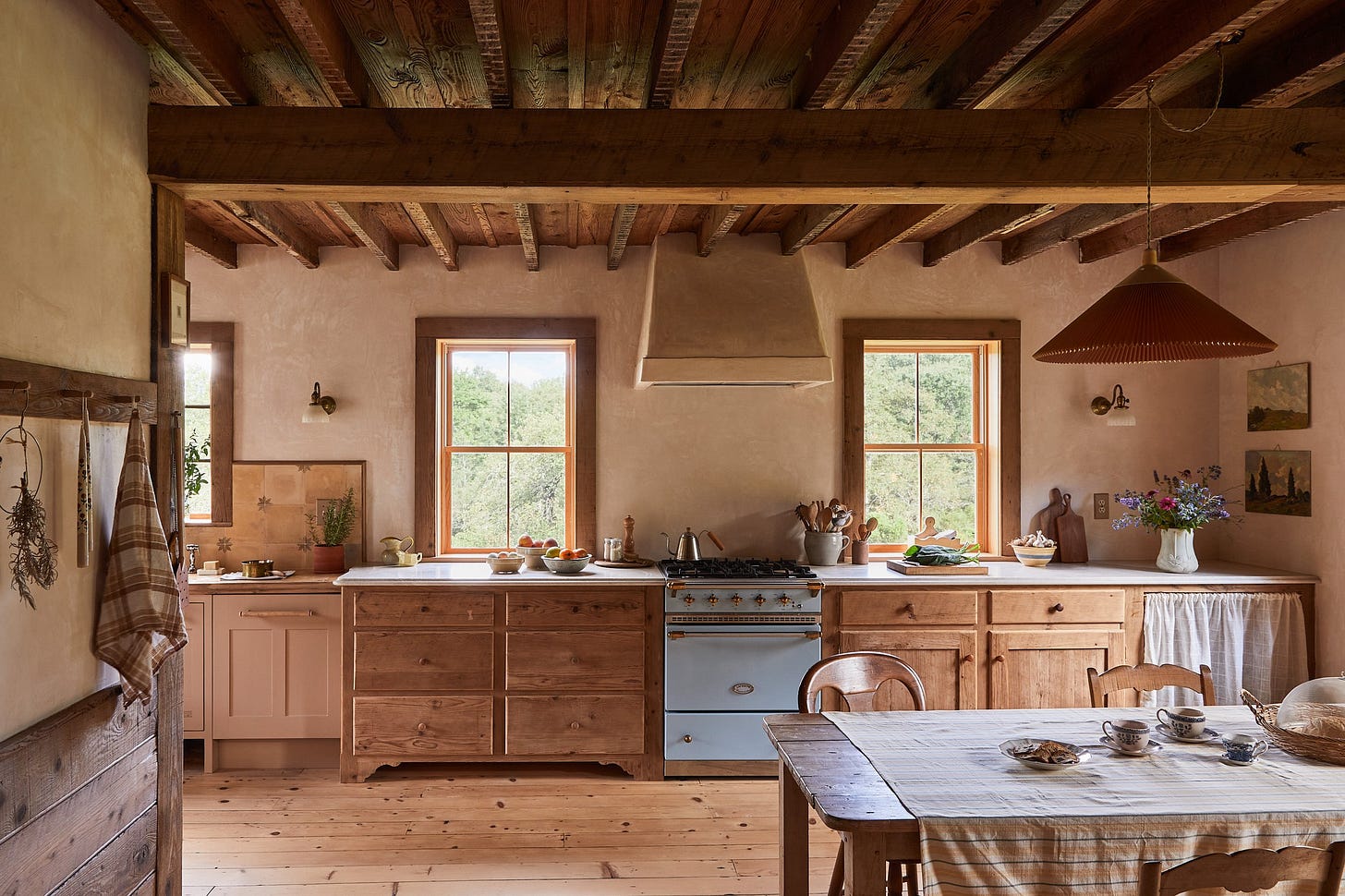
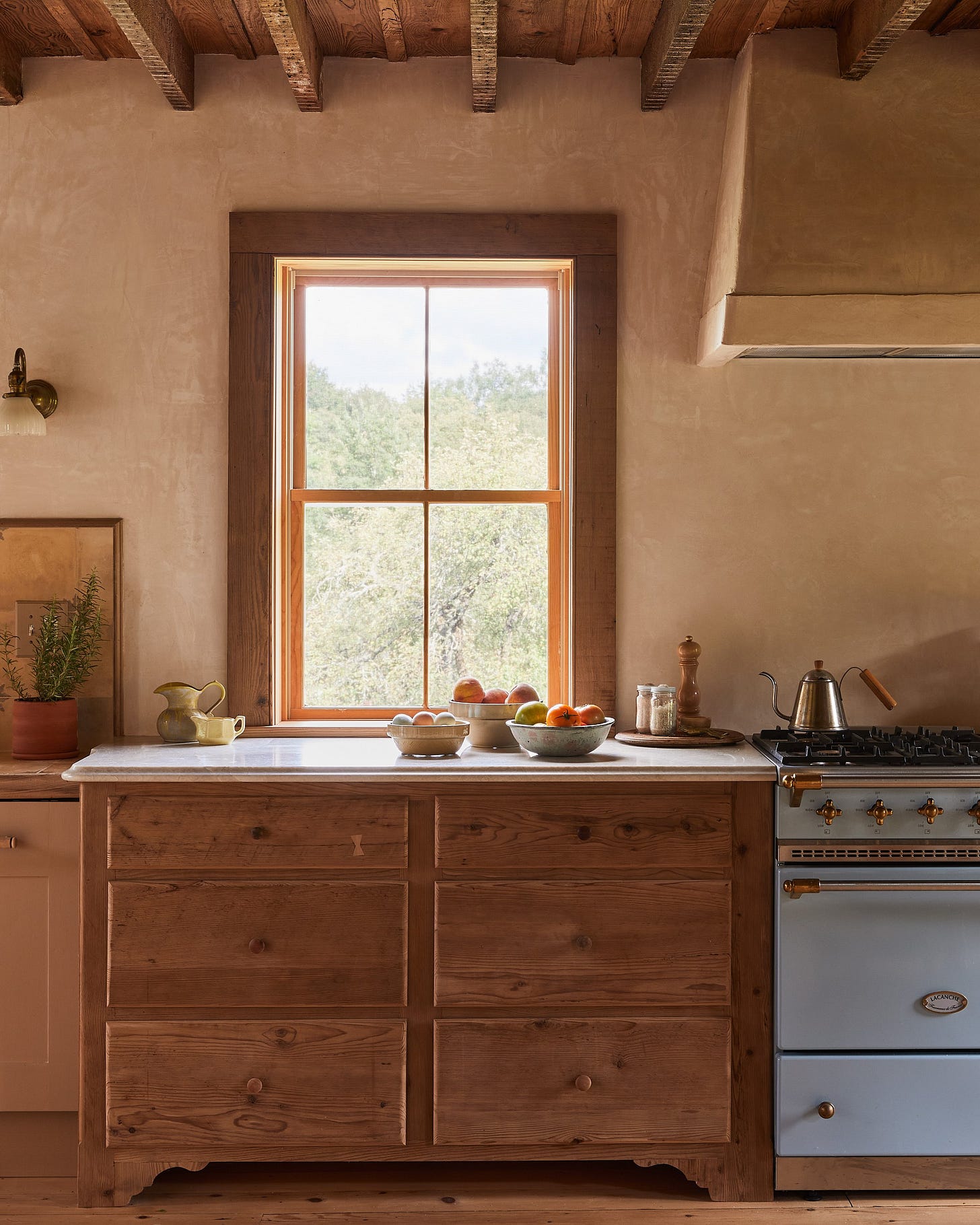
The new kitchen in their farmhouse is located along one exterior wall punctuated by three windows. Tara and Percy exposed the ceiling joists and left their original lath and plaster markings intact. Percy, a master of plaster work, replastered many of the walls in the house, including the kitchen walls and range hood. The original wood plank floors in this room were sanded and refinished.
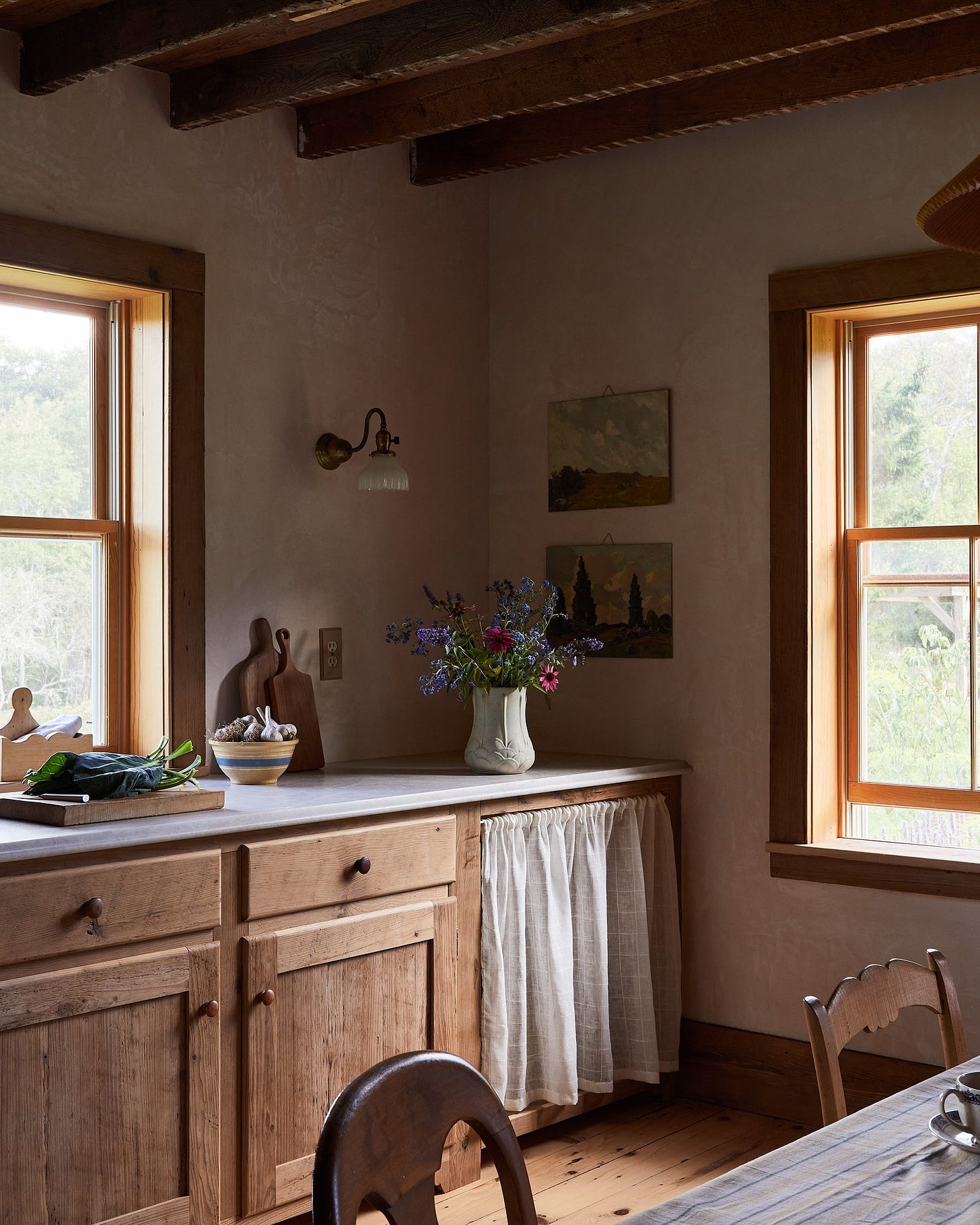
The cabinetry is “unfitted,” a term that describes the look of having free standing furniture pieces instead of traditional built-in cabinetry. The Lacanche range is flanked by base cabinets in aged natural wood, one resembling a chest of drawers, the other, a sideboard, both with simple wooden knobs. The far base cabinet has a gathered fabric curtain in lieu of doors. Theses cabinets are topped by a simple white marble with an ogee edge.
I appreciate that there’s no kitchen island, but instead there’s an antique table and mismatched chairs, like there would have been when the house was built. A peg rail in a kitchen is always a good idea.
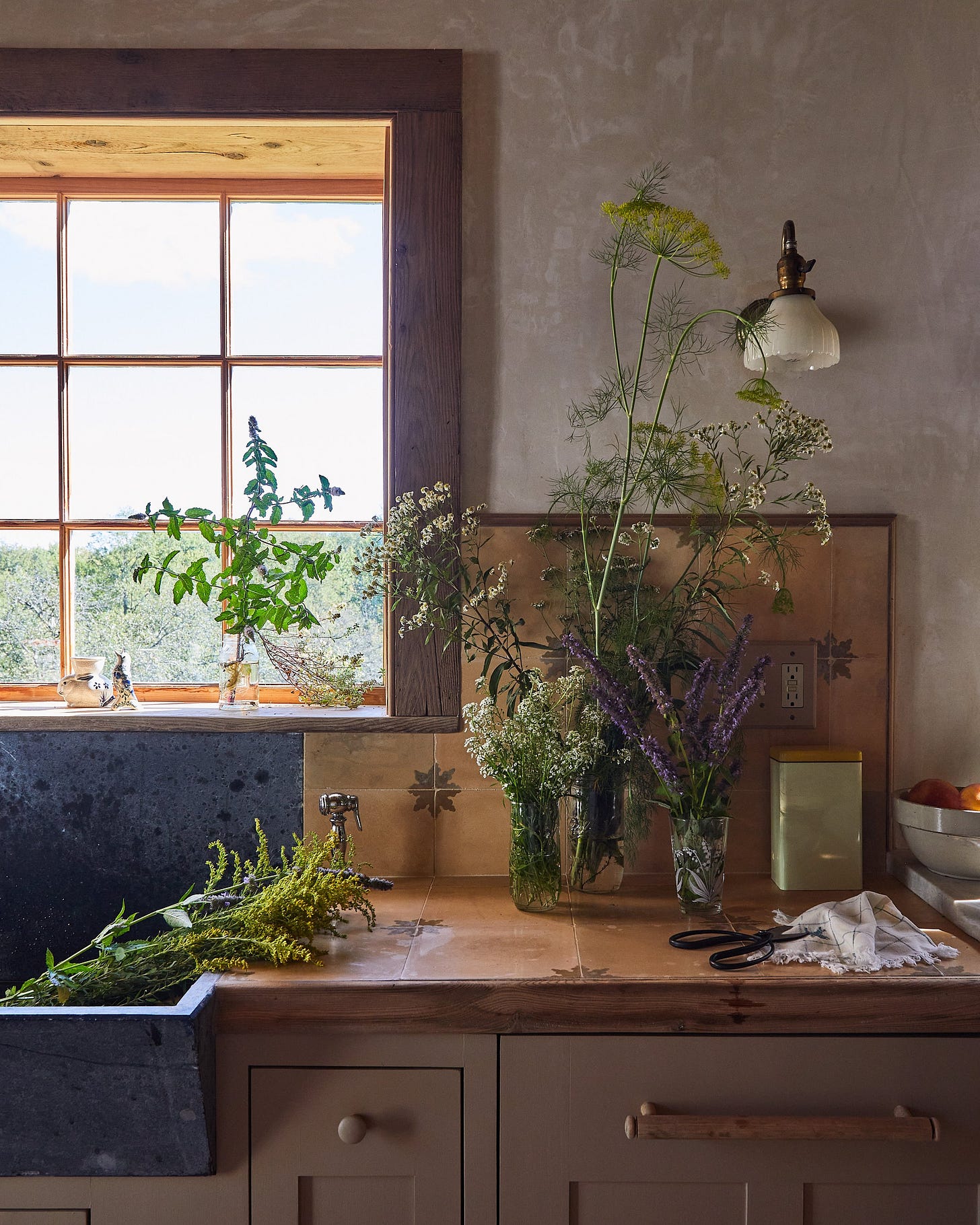
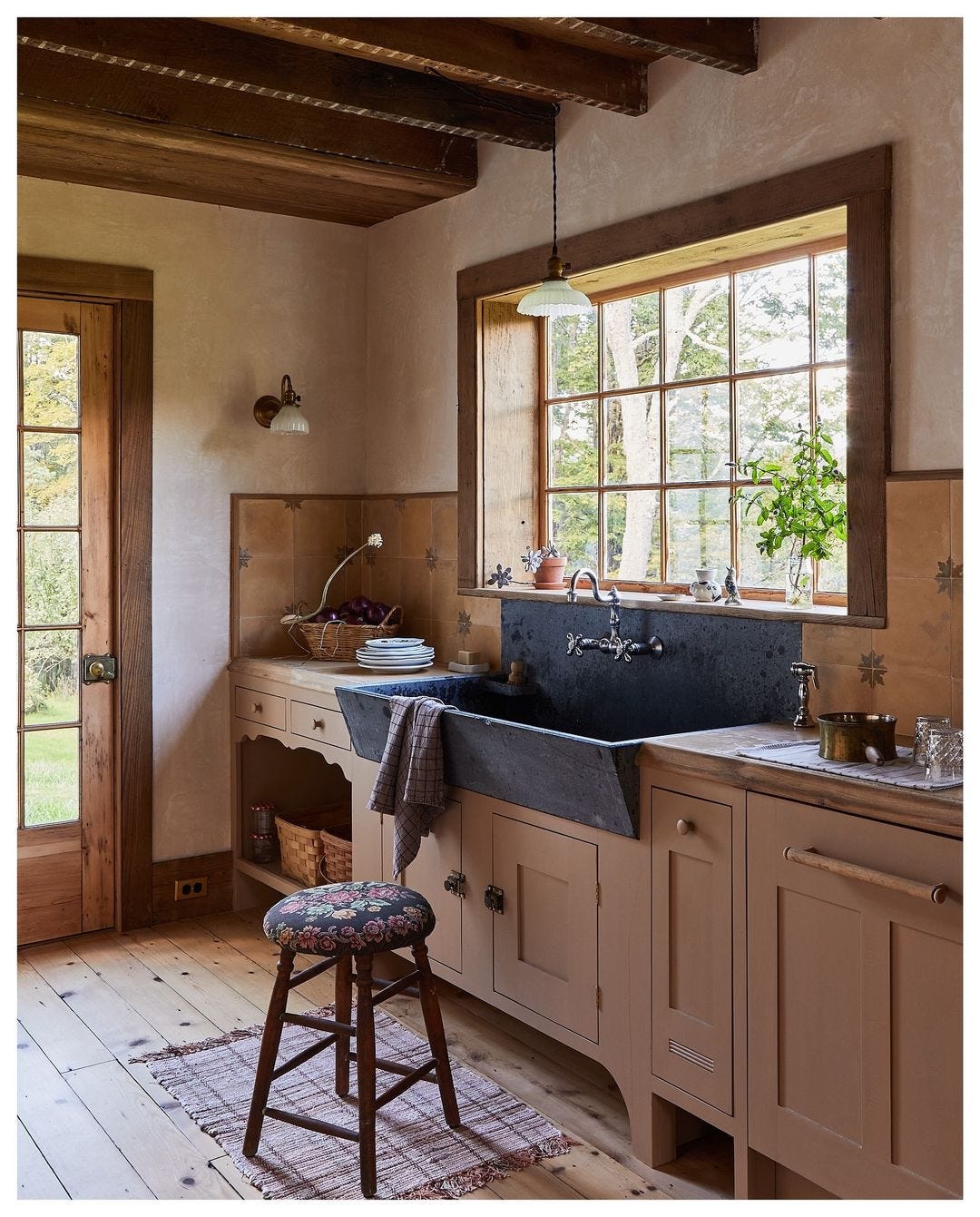
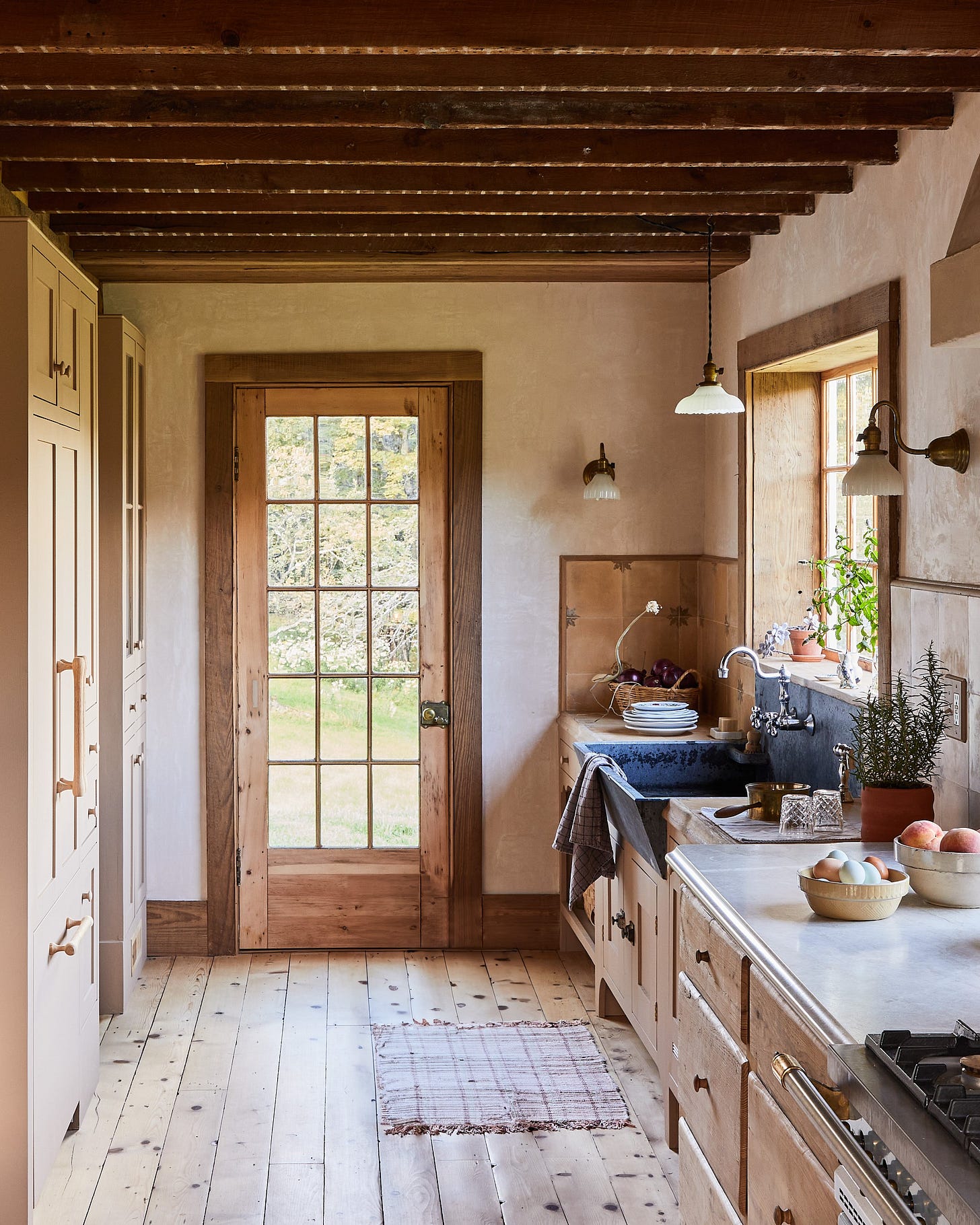
At the left end of the kitchen wall is the washing zone, with a large soapstone sink tucked under the window as the main event. The base cabinets in this zone are a painted Shaker style with inset doors. The base cabinet at the far end is open, and has a pretty scalloped apron detail. To further differentiate this section of the kitchen from the range zone, and emphasize the unfitted look, Tara and Percy used tile on the walls and counter, with a simple wood edge band all around. To accent the difference even further, the counters in each zone are even a slightly different height.
A simple cotton rag rug warms the floor in front of the sink (my mom always had a rug in front of her kitchen sink), and an antique stool with a crewel seat cover is ready for anyone who needs a perch. A divided lite door leads to the outside, while the full-height cabinetry across from the sink offers more storage and a hidden refrigerator.
There is no overhead lighting in the space, save for an antique pendant over the sink and a vintage pendant over the dining table. Task lighting is provided by sconces with milk glass shades on the walls above the countertops. I do like frosted or milk glass shades on sconces, because it allows the light to expand into the room, not just directing it straight down as an opaque shade would.
I love to take in how a room is styled. I know “styling” can feel big and scary and many people wonder, How does one actually do it? To me, the best styling is simply a snapshot of real life. Near the range, we all need a minimum of salt and pepper, so why not have them in pretty dispensers (and if you didn’t know, freshly cracked pepper from a pepper mill has superior taste to pre-ground pepper from a can, plus the pepper mill is so pretty. Grin.). Decant salts and seasonings into pretty containers. Here the salts are in clear glass jars and a salt cellar. Then, gather all these smaller bits - salts, pepper grinder, salt cellar, onto a tray, or cutting board acting as a tray. This way, they read more like an intentional collection instead of a cluttered corner of little things.
Decorative bowls (stoneware are beautiful) in different sizes, filled with fruit, vegetables, and eggs - which all can sit out on the counter in ambient temperature (eggs, if they’re unwashed farm eggs) - form a beautiful still life all on their own. Groups of three of anything are always good. I don’t typically have things out on my counter that aren’t serving a purpose, as things can easily become cluttered this way, but the two pitchers on the counter here are a great example of how you can successfully group two things, in differing sizes and styles - even in a cupboard or on a shelf.
Plants in a kitchen are one of my top inclusions. They just bring life to the space, especially if it’s a potted herb, like this rosemary. They’re also good at hiding light switches or outlets from view. Wink.
Remember, anything can be art. Antique oil paintings with the frames removed, a jug of wildflowers, a collection of cutting boards leaning against the wall (I have a similar collection in my kitchen), a pottery bowl full of garlic, and even a still life of vegetables ready to be chopped on a board. Life is art. Living is art. When the pieces in your life are beautiful (notice there are no plastic containers, nothing with labels or words, no small appliances sitting out on the counters, no clutter, etc.), there will be a sense of beauty and calm to your home.
I’m curious to hear your thoughts about this beautiful kitchen! What do you find inspiring?
Tara & Percy’s house is featured in the current issue of House & Garden UK. Click here to subscribe.


It has a kind of Andrew Wyeth feeling about it. That desaturated look.
Carmella:
Love this setiesof Read The Room. This kitchen, is done mindfully, the plaster walls, ( cool to be expert on those), especially liked the free standing furniture, oh yes my Mom always had an rug at the kitchen sink as myself and sisters do now. The milk glass for lighting love that., do have my little vintage lamp in the kitchen.
This is kitchen is done beautifully, the rawness, natural, rustic, and my fav unlike all the glitz, they really did an awesome job in tune with the era.
Thank you
Karen