Read the Room - where I walk you through a room and let you see with me. To inspire and inform, with ideas and concepts, with ways and means, for living in and furnishing our homes.
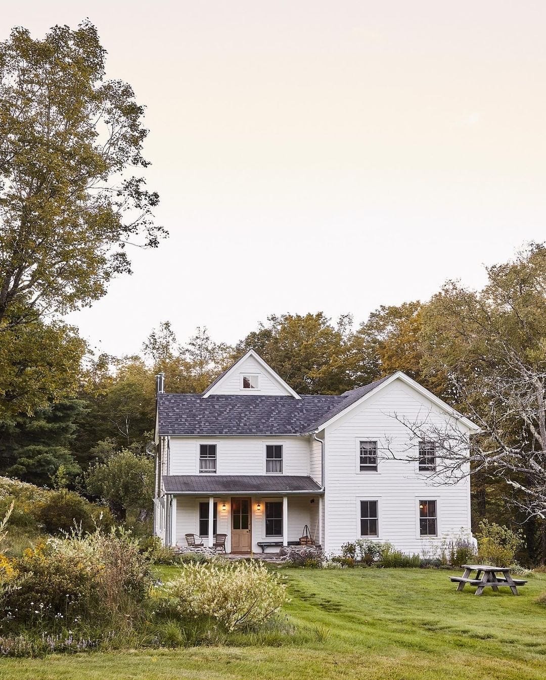
We’re back at Tara Mangini and Percy Bright’s upstate New York farmhouse today, and will pick back up on the main floor and tour through the foyer and great room, which holds the living and dining areas. All design and construction was done by Tara and Percy of Jersey Ice Cream Co., photography by Kate S. Jordan, and styling by Brittany Albert. (If you’ve not yet seen it, you may wish to begin with the kitchen tour here.)
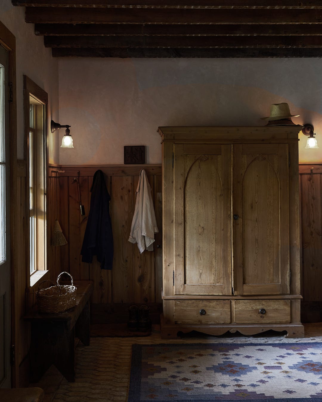
Upon entering the front door under the covered porch, we find the foyer. Right away, the aesthetic tone of the house is revealed in this entry space with its exposed joists that still have their markings from the original lath and plaster. The top portion of the walls are finished in Percy’s trademark plasterwork, the lower portion is planked in vertical beaded boards topped by a peg rail (nobody ever wonders where to put their coat). The cap on top of the peg rail acts as a narrow ledge, perfect for leaning framed artwork here and there. The only lighting we can see in the photos are vintage sconces that wrap the room, which give off warm, indirect lighting that feels soft and inviting. The floor is covered in a rustic picket pattern tile.
So often, our default idea for storage in a foyer is a built-in closet. If the room allows, I love to see antique wardrobes like this one used instead. It brings such character to this room, and offers closed storage with both doors and drawers. And because having a place to sit for putting on and removing shoes is key, there are two simple wooden benches, one below each window flanking the front door.
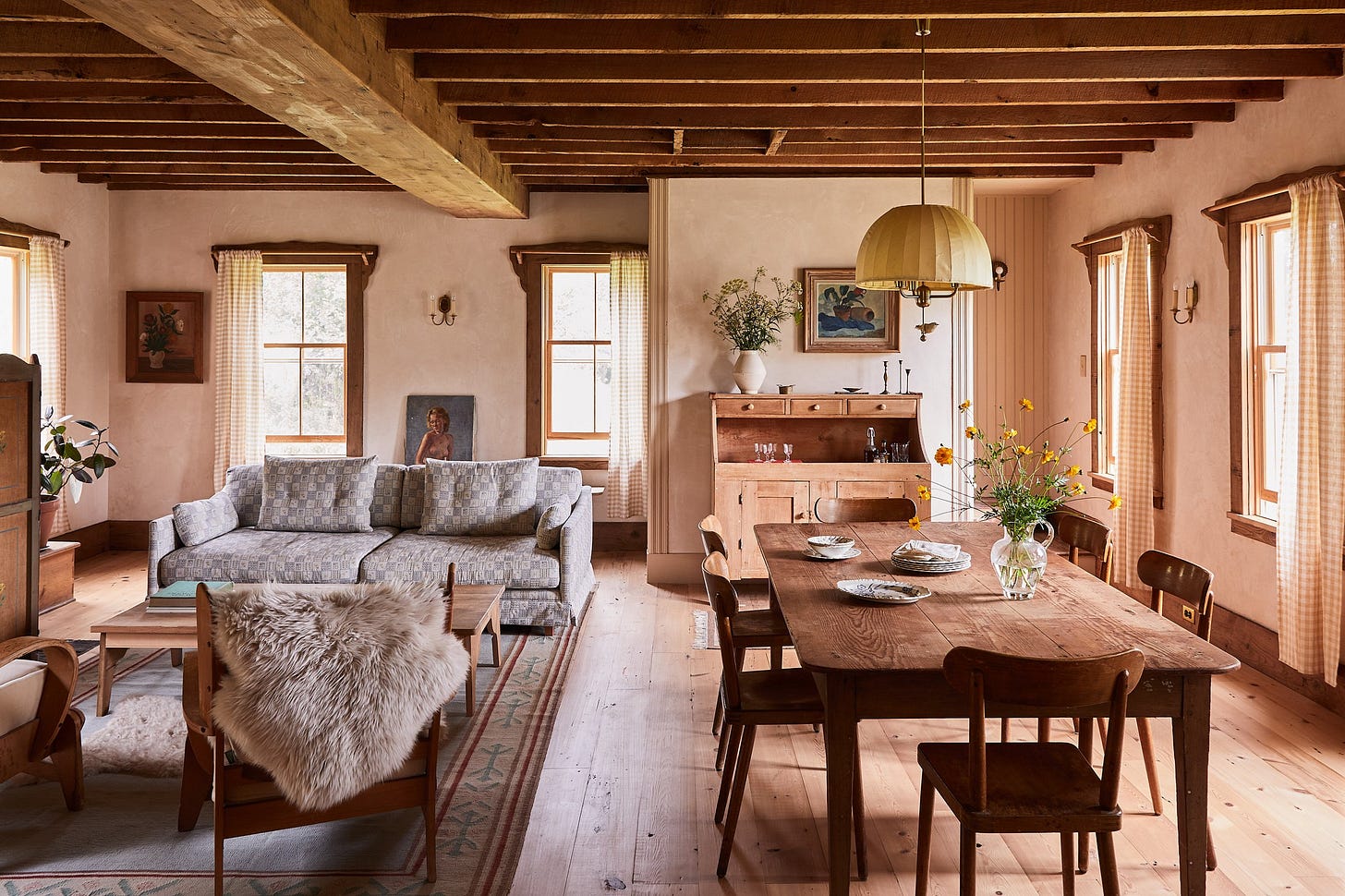
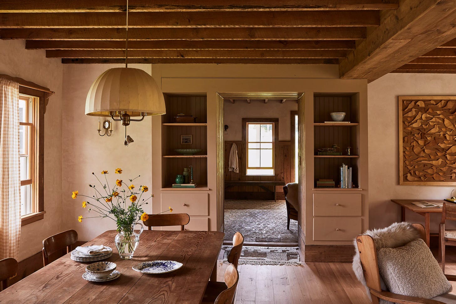
From the foyer, you step through a cased opening and into the great room where the dining area is laid out on one side and the living area on the other. Tara and Percy took what was once a warren of rooms and opened them up to create what you see here. The first thing that strikes me about this room is that there are windows on three sides. This is the holy grail in architectural design, when it can be achieved. The experience it provides with the sunlight traveling throughout the day, falling from one side of the house to the other, is remarkable. And it allows the capturing of nature’s air conditioned cross breeze when the windows are open.
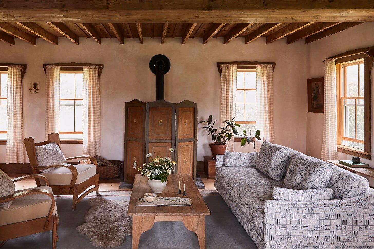
Percy’s plasterwork that began in the foyer continues in here on all the walls, floor to ceiling. The mottled color of the plaster is just beautiful and gives a perfect balance to the rough ceiling joists and oiled white oak floors. Tara and Percy created a unique scalloped trim for the tops of the windows and integrated the curtain rods into the design, successfully breaking the rule of never hanging curtain rods from window trim (typically, it should always hang 6 or more inches above the window trim). Tara made the curtain panels from lengths of gingham fabric with a simple rod pocket at the top. The shorty length seems to work well, too, with the height of the baseboard.
Other than the dining pendant, the room is lit only by vintage sconces around the room, echoing the same idea as the foyer, only here they chose a different, candle style. Lighting the walls with sconces instead of the floors with recessed cans gives a much better ambiance to the room.
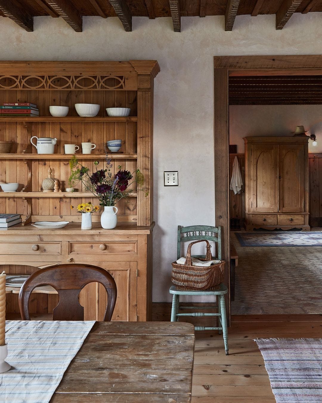
From the opposite side of the room, looking back toward the foyer, we can see how they brilliantly cased the large opening with two built-in cabinets. The walls and ceiling of the opening are finished in beaded board and the whole thing is painted a lovely shade that is a deeper tone of the walls. The depth of this piece and its lower ceiling, create a short hallway of sorts, giving the transition into the great room its own unique experience. The shelves of the built-ins can display books or vessels and the deep drawers can easily hold full sets of dinnerware. Plaster, paint, and natural wood in the same room offer subtle layers of interest.
On the living room side, a furniture grouping is gathered on a large area rug in front of the wood stove. Note that the size of the rug matters! When a rug is used in a furniture grouping, all or most of the furniture should sit on the rug. Tara and Percy had the sofa newly upholstered in a blue and white print, a great nod of assurance to all who are contemplating using a print on a large piece of furniture. The arm chairs are vintage and came with the house. Perhaps my favorite item in the room, however, is the antique hand painted screen that hides the wood stove in summer. Love, love.
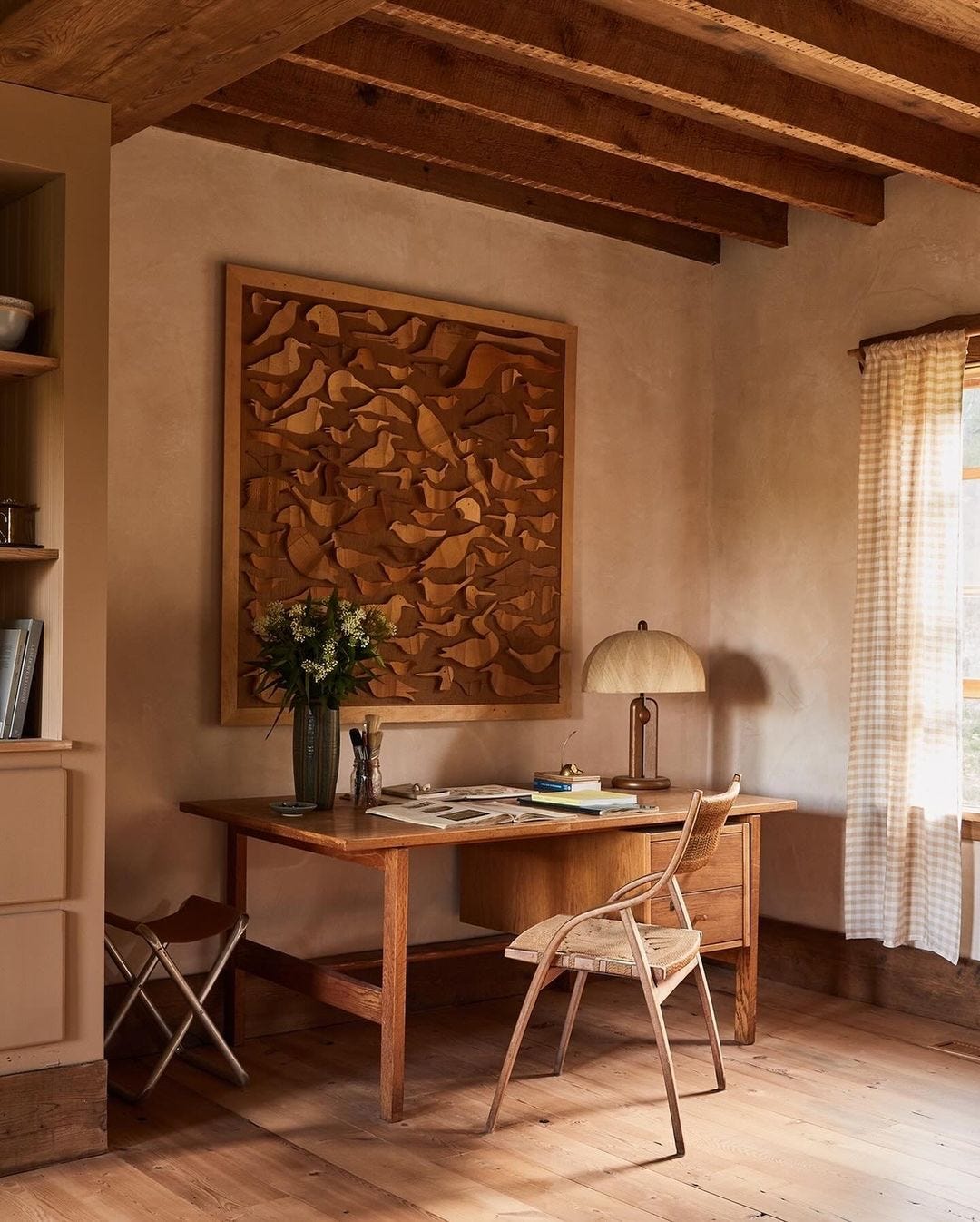
At the end of the living room side is a desk with an amazing vintage chair. This is how taking the time to find vintage is so impactful - it’s the opportunity for a one of a kind piece that shows craftsmanship, wear and patina. The duck art piece above the desk is truly unique and blends so well with the other wood tones in the room. A vintage desk lamp provides task lighting. I appreciate how this translucent shade allows light to fill the entire corner here, and not just the surface of the desk.
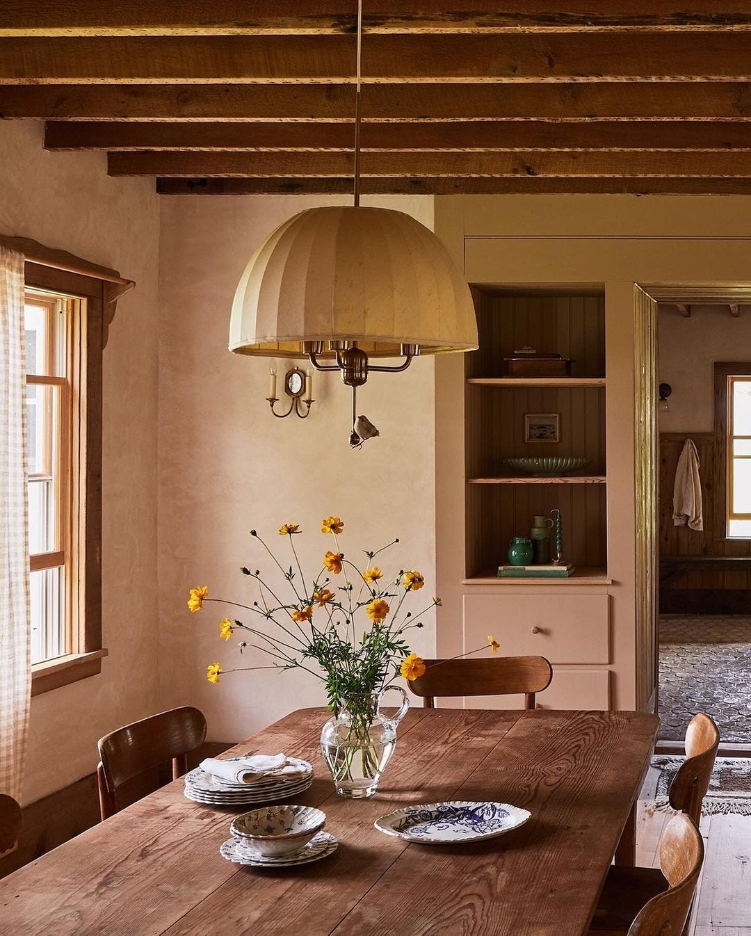
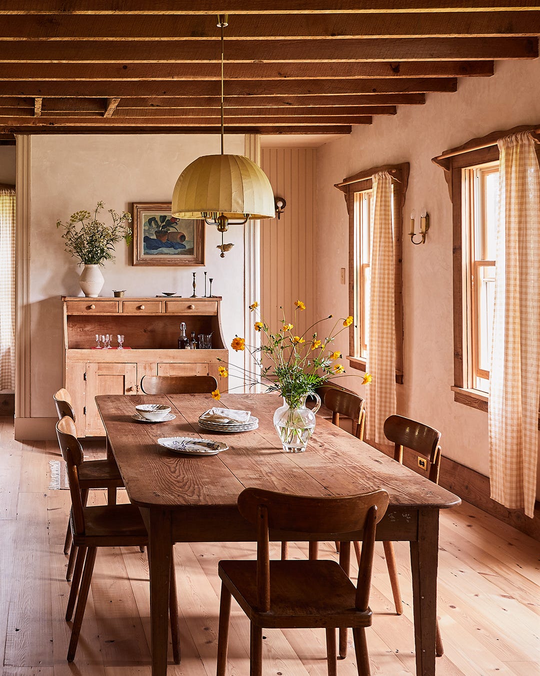
Now to the dining room side. The only overhead light in the room is this vintage pendant over the dining table. All vintage lighting can (and should) be rewired by a professional (check your local independent lighting store for this service). This light also has a translucent shade to diffuse the light into the whole room. If you’re ever wondering how high a pendant should hang above a table, 30-36” is the typical range. I often land on 33.” It’s a good idea to create a scale mock up of the light and the table to get a visual for a final height. And always, always have your fixtures purchased before building or remodeling begins, so you know exactly where to have the electrician place the junction boxes.
How about the sweet little bird sitting on the lower finial of the light fixture?
One note about flowers in a vase - you don’t have to feel overwhelmed about it or feel like you have to be a floral designer to make a lovely vase of flowers. Using all one kind of flower is a great, easy trick, and a good rule of thumb is to have the height of the flowers be 1.5 times the height of the vessel, like these are. See how balanced that looks?
These china transferware plates and linen napkins were likely placed on the dining table by the stylist for the photo shoot (beautiful), but if you have a designated dining table that’s not used every day, why not set stacks of your favorite dish ware on it, just like this, as display? I love the idea.
At the opposite end of the dining table sits an antique dry sink, acting as a side board, with storage and surface area for drinks, dessert, or platters filled with food. Now look above it. Notice how the oil painting is hung off center, then balanced by the large vase of wildflowers, a wonderful example of how art and objects don’t have to be symmetrical or centered, just balanced.
Behind the wall that the dry sink sits on is a stairway to the attic, a lovely space I can’t wait to walk through with you in another post. But, next time, we’ll head to the bedrooms.
Loves! I’ve opened up my calendar from September through the end of the year for Design Cue and Design Coach interior design packages. I’d love to help you live well in your home. Read more and book a slot with me right this way.


There was an actual TV show, I think it was Magnolia Network, about this home just recently..."The Story of Home". A lovely slow down and watch a couple of episodes show.
Simply elegant. And your writing pointed out subtleties that I hadn’t noticed…because they sat so quietly and were harmonious with the whole.
Thanks for another Read The Room journey.
Enjoy your day,
Birnie