Read the Room - where I walk you through a room and let you see with me. To inspire and inform, with ideas and concepts, with ways and means, for living in and furnishing our homes.
We’re back at Tara Mangini and Percy Bright’s upstate New York farmhouse today, and will continue our virtual tour in the bedrooms. All design and construction was done by Tara and Percy of Jersey Ice Cream Co., photography is by Kate S. Jordan, and styling by Brittany Albert. (If you’ve not yet seen it, you may wish to begin with the kitchen tour here, and the main living spaces here.)
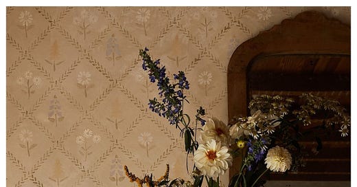
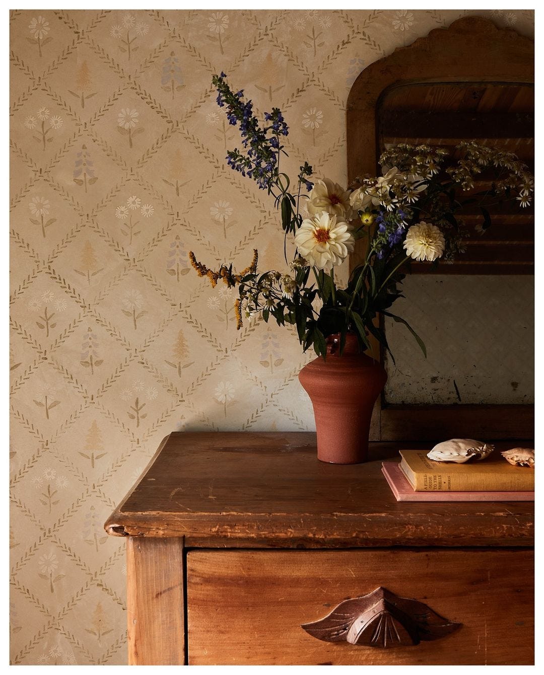
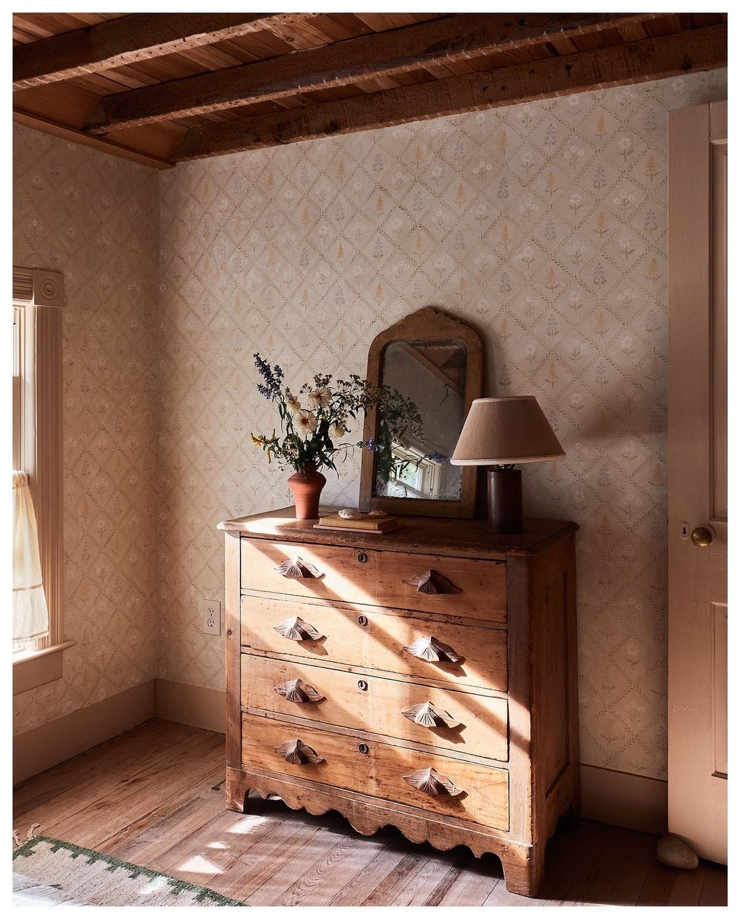
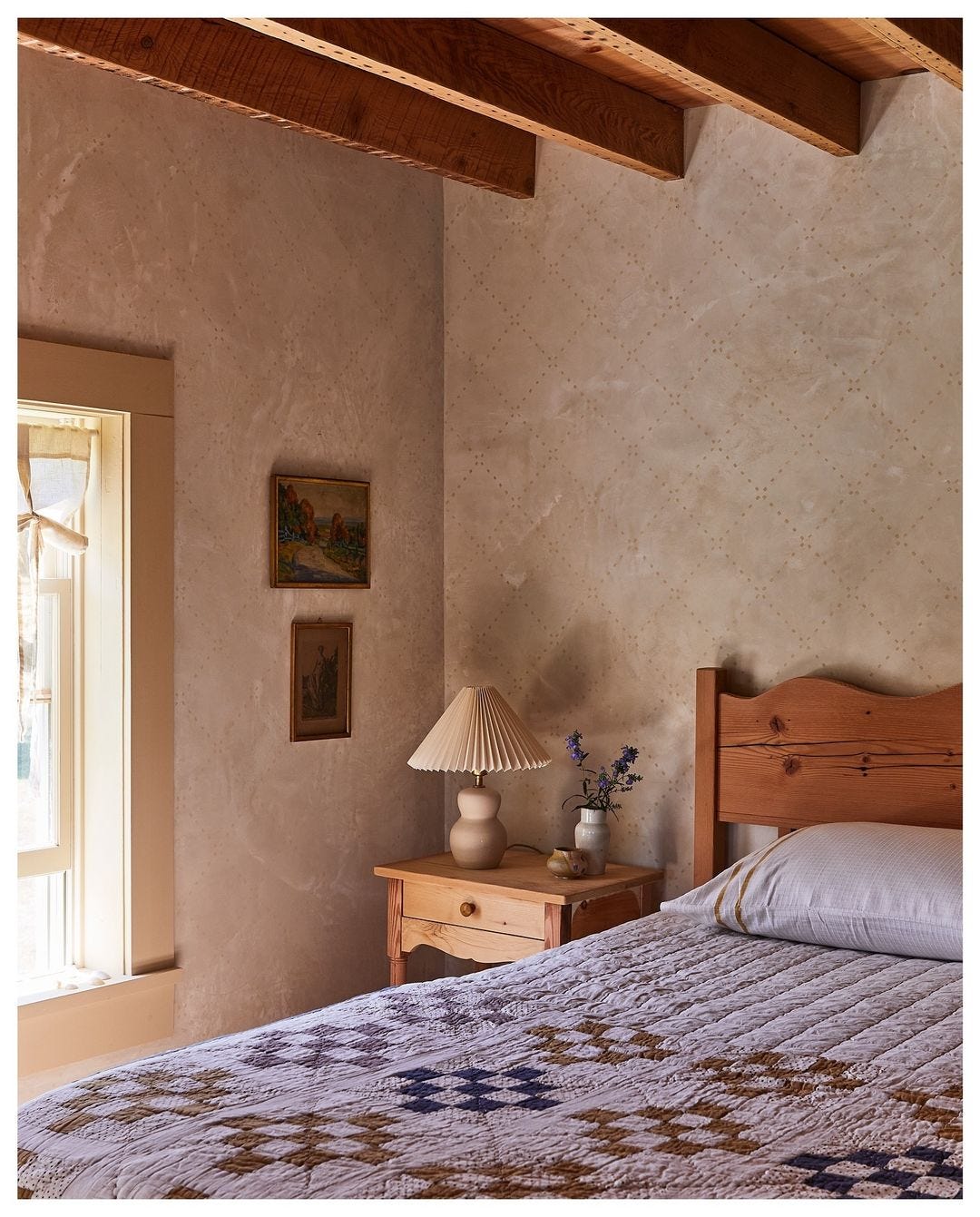
We’ll begin in the wildflower room, as they call it. All the walls in the bedrooms were finished in Percy’s signature plasterwork, as we’ve seen in the main rooms of the house, but here, Tara and Percy hand stamped designs over top of the plaster, using tempera paint and their own hand-cut stamps.
In Tara’s words, “When the light catches in here, it’s pure magic!” As you can see, the room is not large, but the simple furnishings and quiet palette make for a soothing space to rest. Typically, the bed is the main focal point in a bedroom, and I love it when the bed is placed so that you get the full experience of it’s welcome when you walk into the room, like this one does.
The style of the wooden bed frame is simple, yet interesting, and balances the visual weight of the antique dresser on the opposite wall. The bed is dressed just as simply, in gingham sheets with a larger buffalo check quilt over top.
Beneath the bed is a vintage rug. Notice the size of it. A rug under the bed should be large enough to extend beyond the bed width so that you could step onto the rug from the bed without feeling crowded. Vintage lamps on the dresser and nightstand provide soft pools of light. There is a single flush mount fixture with a plaster shade provides more light from the ceiling when needed. Seeing the art on the nightstand, here, reminds me - you don’t have to hang art, leaning art is unexpected and interesting.
In a guest room, it’s always good to think about what guests would need to feel comfortable and cared for. A mirror in the room is so helpful, and the cafe curtains at the windows allow privacy as well as an open view above of the trees and sky outside. Placing a vase of flowers in the room is a favorite way of making them feel welcome and their visit celebrated.
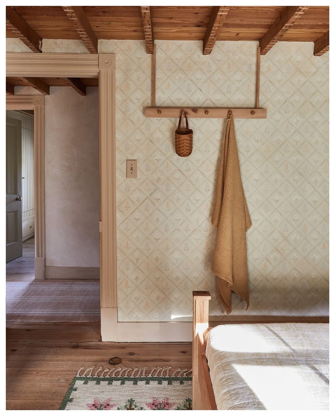
In lieu of a closet, this guest room has a peg rail, which was brilliantly hung from the ceiling joists so as not to disturb the beautiful plaster work. Across the hall is a glimpse of a bathroom, which we’ll tour next time. Can’t wait for you to see!
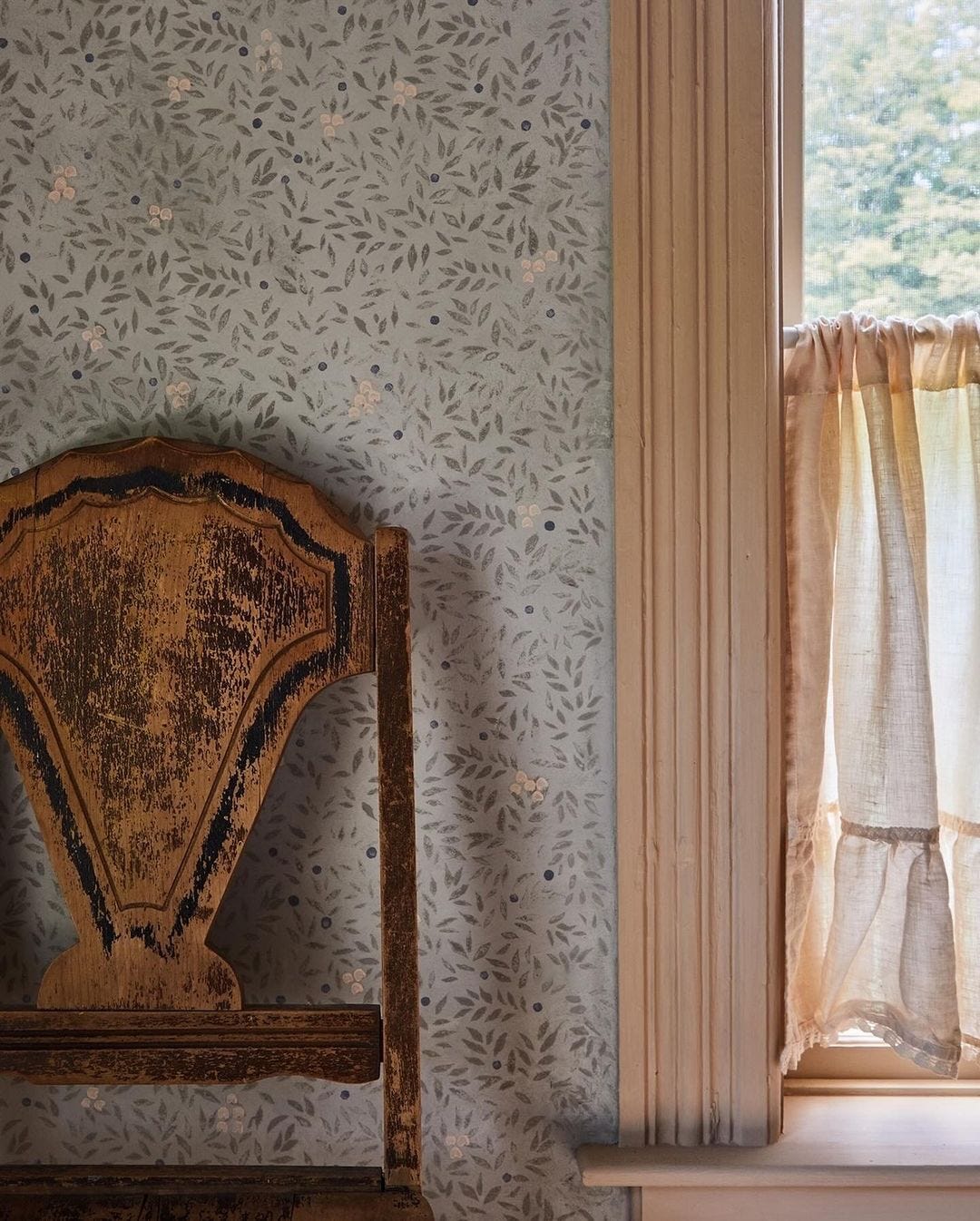
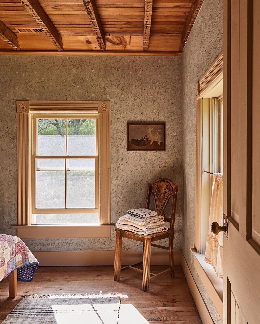
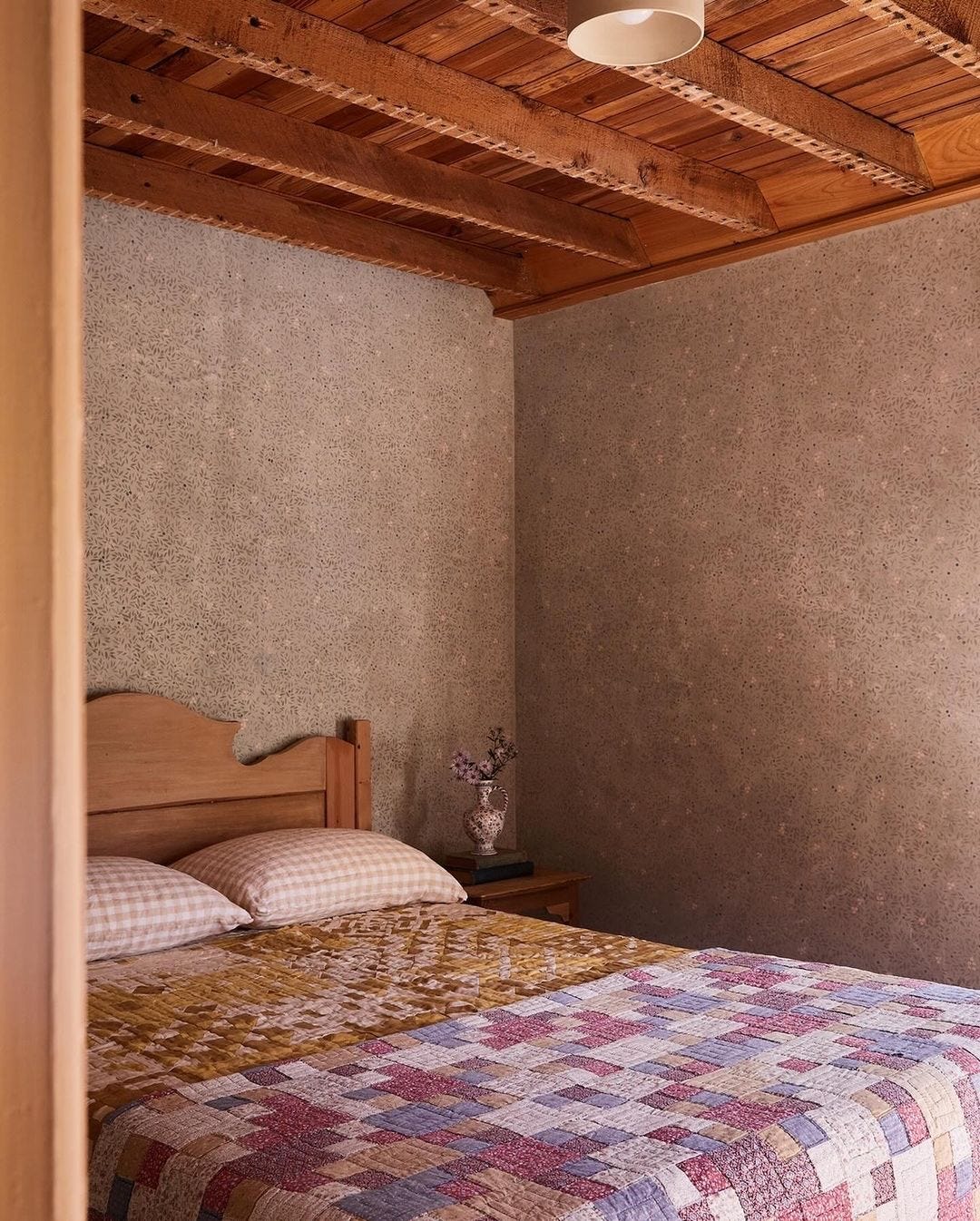
Onto the delightful blueberry room! It was inspired by the many wild blueberry bushes on their 40 acre property, and done in a similar way as the wildflower room, using tempera paint to stamp the custom cut design onto the plastered wall. It’s simply beautiful.
You’ll notice that all the interior doors and trim are painted a warm beige-pink. The chair in the corner, the room’s only furnishing besides the bed and nightstand, is the perfect place to set extras the guests might need. A ruffled cafe curtain provides privacy, and on the floor, Tara chose to place a smaller area rug in the space at the foot of the bed. (Hmm, seems like I’ve seen that before…)
Isn’t it lovely? The double quilts look beautiful together, the warm and cool color pallets complimenting each other so well. This time, we see a pale gingham check on the sheets and pillowcases.
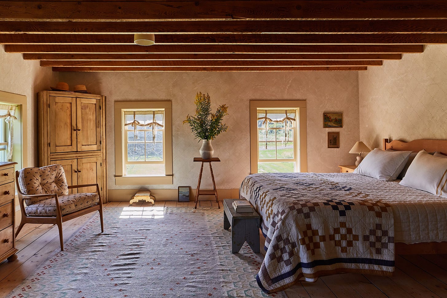
And lastly, the primary bedroom. The stamped pattern walls here is quieter, more subtle, and so appropriate for the main bedroom. We see the common theme of simple wooden furniture here as well, with thrifted lamps and flowers in vases.
The larger size room handles the king size bed and an assortment of furniture well, all vintage or antique, yet the room still feels airy and open. A large area rug provides softness to the floor, and the same flush mount ceiling light is repeated here, too, keeping things consistent and simple. Notice there is no art hanging above the bed. Isn’t it refreshing to know you don’t have to hang art above the bed?
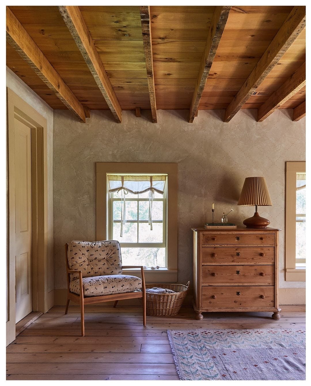
Tara covered the windows in tied cotton roller shades, a touch extra but not too much, and she tucked a cushioned vintage chair into the corner. It’s one of my personal rules as well, if at all possible, to have at least one bench, chair, or window seat in every bedroom. Beside the chair, an antique pine dresser offers storage while providing a surface for a lamp, a couple books, a candlestick, and a vase with a single flower. When you pause and take a moment with rooms like this, you come away inspired. You find that they really are so lovely, and it takes so few things to make them that way.
Loves! Are you needing some design help with your home? Do you need ideas for a room refresh? Are you contemplating a remodel and are not sure where to start? Do you need help finding the best furniture layout for your space? There are spots available in my calendar for my Design Cue and Design Coach virtual interior design packages. I’d love to help you live well in your home. Read more and book a slot with me right this way.





Lovely cozy rooms.
Carmella,
Rustic Elegance with Simple Beautifulness.
The plaster walls, Rugs, Double Quilts are so in tune to the home.
Omg so glad you highlighted the No Picture above the bed, we have never hung one or the guest bedroom here at the farmhouse.
To think about we haven’t in any of our houses.
Thank you for sharing this with us all.
Karen